
Gauge
Reading time:
A Gauge Chart is useful for displaying a KPI against a defined scale and highlighting performance using coloured intervals.
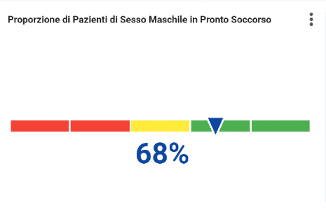
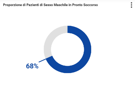
How to create a Gauge chart?
The following example displays the Occupancy Rate (%) on a circular gauge with coloured ranges:
- 0–30 → Red (Low)
- 30–70 → Orange (Medium)
- 70–100 → Green (Good)
The gauge value is displayed in the centre, with the scale shown around the dial.

Step 1: Create the Chart
- Add a new chart to the dashboard.
- Enter a chart name (for example Occupancy).
- Select Circular Gauge as the chart type.
Step 2: Configure the Data
Open the Data tab.
Measures
Add the measure containing the value to display.
Example:
No dimension is required for a simple gauge displaying a single KPI.

Step 3: Configure Intervals (Optional)
If you want to colour the gauge according to value ranges, define intervals.

The gauge will automatically apply the configured colours to the corresponding sections of the scale.
Step 4: Configure Gauge Options
Open the Aspect tab and expand Gauge Options.

Scale Start Value : Defines the minimum value of the gauge
Scale End Value : Defines the maximum value of the gauge
Scalar Font Size (vw) : Controls the size of the value displayed in the centre
Font Weight : Controls the thickness of the displayed text
Mini : Displays a compact version of the gauge