Boxplot
Reading time:
From Version 5.3.0
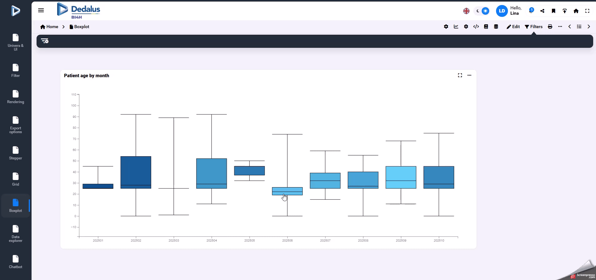
A boxplot is a simple chart that shows how a set of numerical data is distributed.
What a boxplot shows
- Median: The line inside the box — the middle value of the data.
- Box: Shows the interquartile range (IQR), from the 25th percentile (Q1) to the 75th percentile (Q3). This is where the central half of the data lies.
- Whiskers: Lines extending from the box to show the range of the data that is not considered an outlier.
- Outliers: Points plotted individually beyond the whiskers — unusual or extreme values.
Why use a boxplot?
- To quickly compare distributions across categories.
- To spot outliers.
- To understand data spread and skewness at a glance.

How to add a boxplot chart?
To build a boxplot, you must define at least five statistical measures from your dataset. These five values describe the distribution.
Requied measures :
- min
min(measure field)
- 25th percentile (Q1)
quantileExact(0.25)(measure field)
- Median (Q2)
quantileExact(0.50)(measure field)
- 75th percentile (Q3)
quantileExact(0.75)(measure field)
- Max
max(measure field)
These values are enough to draw the core boxplot
If you want your boxplot to display outliers, you can calculate them using the standard 1.5 × IQR rule:
- IQR (Interquartile Range) = Q3 − Q1
- Outliers are any values:
- below Q1 − 1.5 × IQR
- above Q3 + 1.5 × IQR
Formula:
arrayFilter(
x -> x (quantileExact(0.75)(measure field) + 1.5 * (quantileExact(0.75)(measure field) - quantileExact(0.25)(measure field))),
groupArray(measure field)
)
This returns all the values considered outliers so they can be plotted individually.
Once your measures are created:
- Add each calculated measure to your chart.
- Open the Boxplot tab for each measure.
- Assign the correct role (Min, Q1, Median, Q3, Max, Outliers).
Last update: 13 February 2026
Views: 149